29LT ZARID Display: A Contrasted Typeface
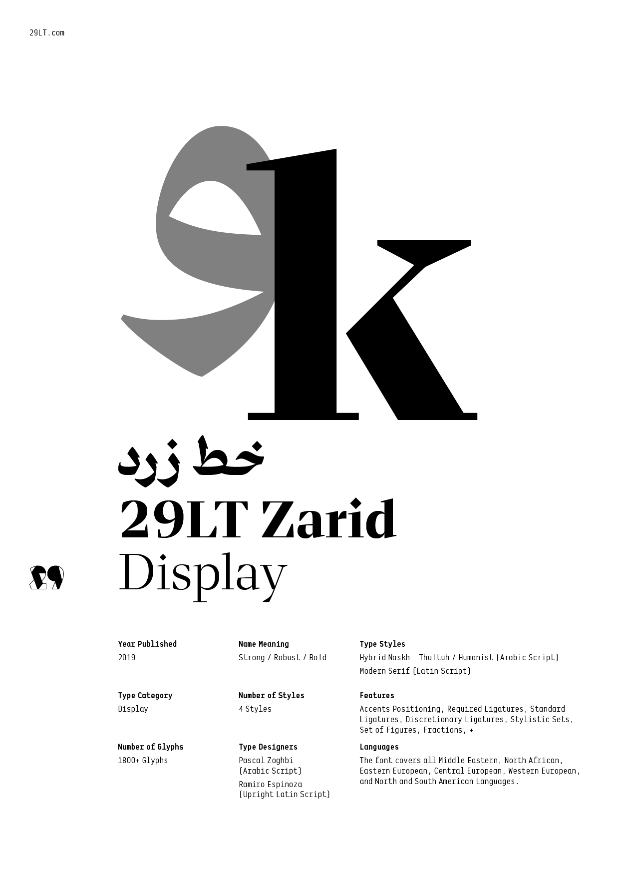
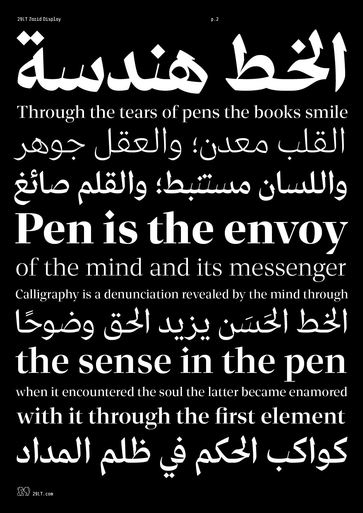
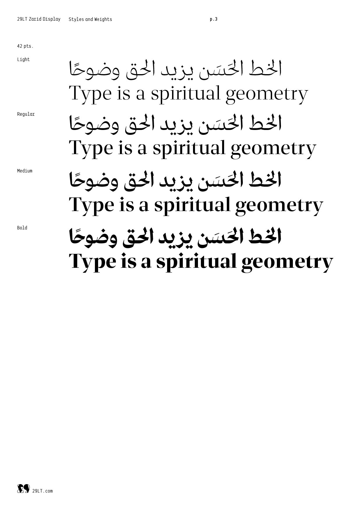
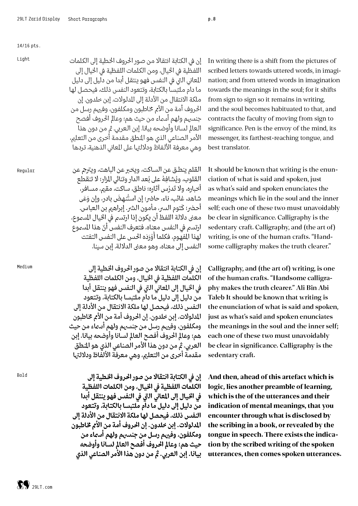
29LT Zarid Display is bold by nature and extreme in character. Its evident strong contrast between thick and thin pen strokes is abrupt and dramatic. Zaid Display type family is intended for display uses and consists of 4 weights: Light, Regular, Medium, and Bold.
Because they stem from different calligraphic routes, Arabic and Latin scripts feature distinctive contrast treatments. Transition from a broad-nibbed pen to a pointed-pen to achieve the desired contrast does not apply to the Arabic letterforms as it does to the Latin counterparts. Arabic is driven by “translation with rotation” using only the “qalam” that is similar to the broad-nibbed pen. On the other hand, the Latin writing theory is based either on the translation principle or the expansion principle. In 29LT Zarid Display, Latin letterforms thus gain vertical contrast inspired by the pointed-pen, whilst keeping a hint of the broad-nibbed pen translation structures in the bowls and finials. Conversely, only Arabic letters with right slanted teeth in their anatomy feature a thin pen stroke. Those with typography bowls, heads, eyes, arms, legs, bellies, tails… have only high contrast in their structure. Although different, both typefaces resonate with one another.
WHY IT IS A TOP PICK
29LT Zarid Display features a large range of weights offering typographic hierarchical solutions in bi-script Arabic and Latin layouts. Its contrasted pen strokes make it ideal for brave headlines and titles whilst being stylish and valiant.
29LT ZARID Superfamily: Diversity and Cohesiveness
Diverse and well thought-out, 29LT Zarid Superfamily is a set of typefaces crafted to work together in close harmony and provide visual cohesion. The typefaces share basic characteristics and common designs yet with differing styles and individual variances, each standing on its own as a useful, distinctive type.
29LT Zarid Superfamily retains a balance between calligraphic angular cuts and unadorned construction. The letterforms are inspired by calligraphic makeup but are rather drawn with a contemporary interpretation. The contrast in the letters is coupled with strong cuts and edges lending the font its crowning robust characteristic.
Arabic and Latin scripts are inspired by one another and match each other. Their synergistic sco-design provide even greater cohesiveness to the superfamily.
WHY IT IS A TOP PICK
29LT Zarid Superfamily is a design tool for graphic designers to explore endless typographic possibilities and explore different communication complexities in their projects. The typefaces convey freshness, robustness, dynamicity, and modernity. They are designed to be easily readable and cover a range of characters allowing for typographic hierarchies.
Ramiro Espinoza (Latin)
Pascal Zoghbi (Arabic)
23rd TDC Typeface Design Competition 2020
Typographic Excellence
Languages
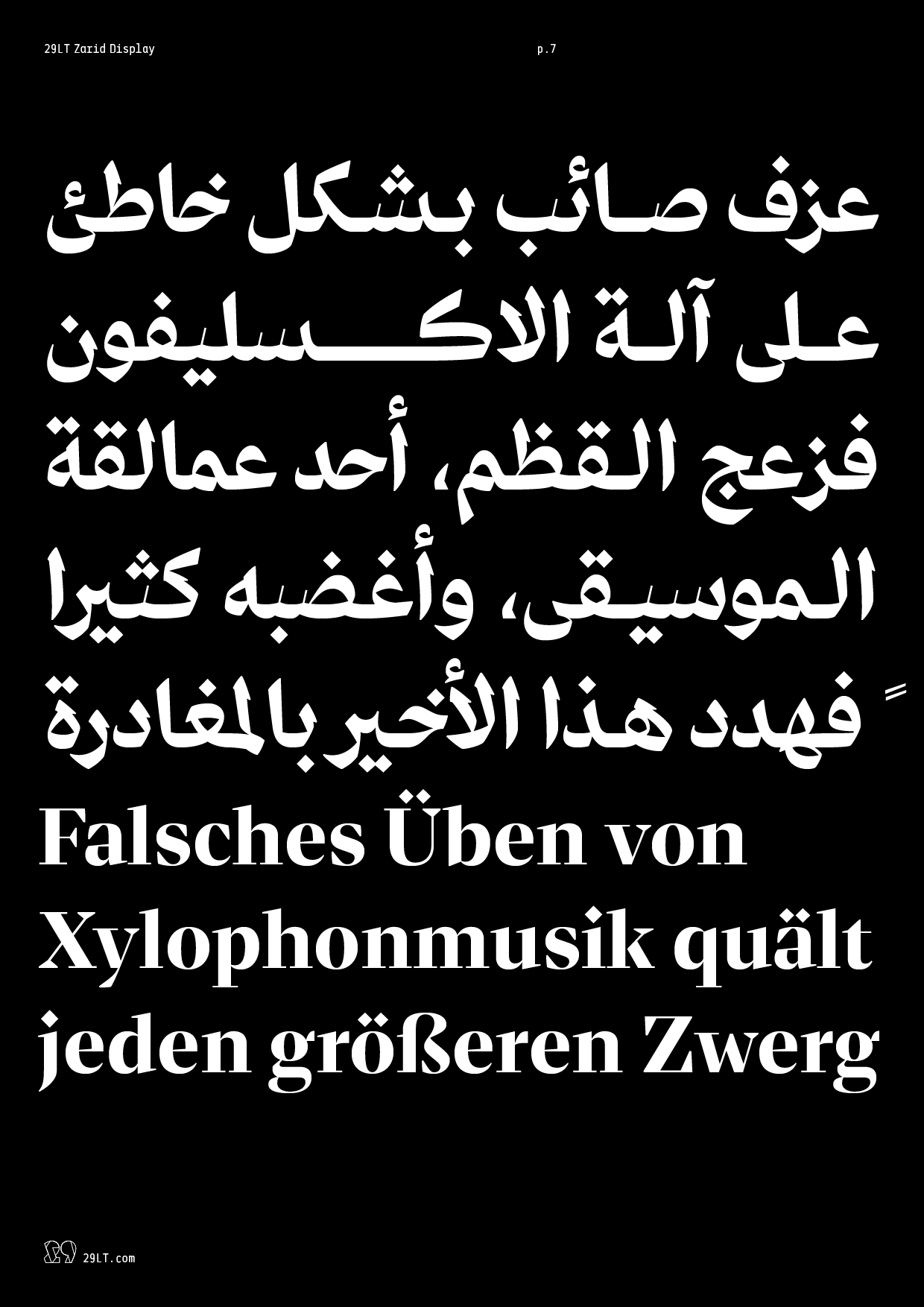
Eastern European, Central European, Western European, North American, and South American languages written in the Latin script.
Afrikaans, Albanian, Arabic, Asu, Azerbaijani, Basque, Bemba, Bena, Bosnian, Catalan, Chiga, Colognian, Cornish, Croatian, Czech, Danish, Dutch, Embu, English, Esperanto, Estonian, Faroese, Filipino, Finnish, French, Friulian, Galician, Ganda, German, Gusii, Hungarian, Icelandic, Inari Sami, Indonesian, Irish, Italian, Jola-Fonyi, Kabuverdianu, Kalaallisut, Kalenjin, Kamba, Kikuyu, Kinyarwanda, Latvian, Lithuanian, Low German, Lower Sorbian, Luo, Luxembourgish, Luyia, Machame, Makhuwa-Meetto, Makonde, Malagasy, Malay, Maltese, Manx, Mazanderani, Meru, Morisyen, North Ndebele, Northern Sami, Norwegian Bokmål, Norwegian Nynorsk, Nyankole, Oromo, Farsi [Persian], Polish, Portuguese, Romanian, Romansh, Rombo, Rundi, Rwa, Samburu, Sango, Sangu, Scottish Gaelic, Sena, Shambala, Shona, Slovak, Slovenian, Soga, Somali, Spanish, Swahili, Swedish, Swiss German, Taita, Teso, Turkish, Turkmen, Upper Sorbian, Urdu, Vunjo, Walser, Welsh, Western Frisian, Wolof, Zulu.
- Default
- Optional
Check the Bundles tab for discounted deals.
