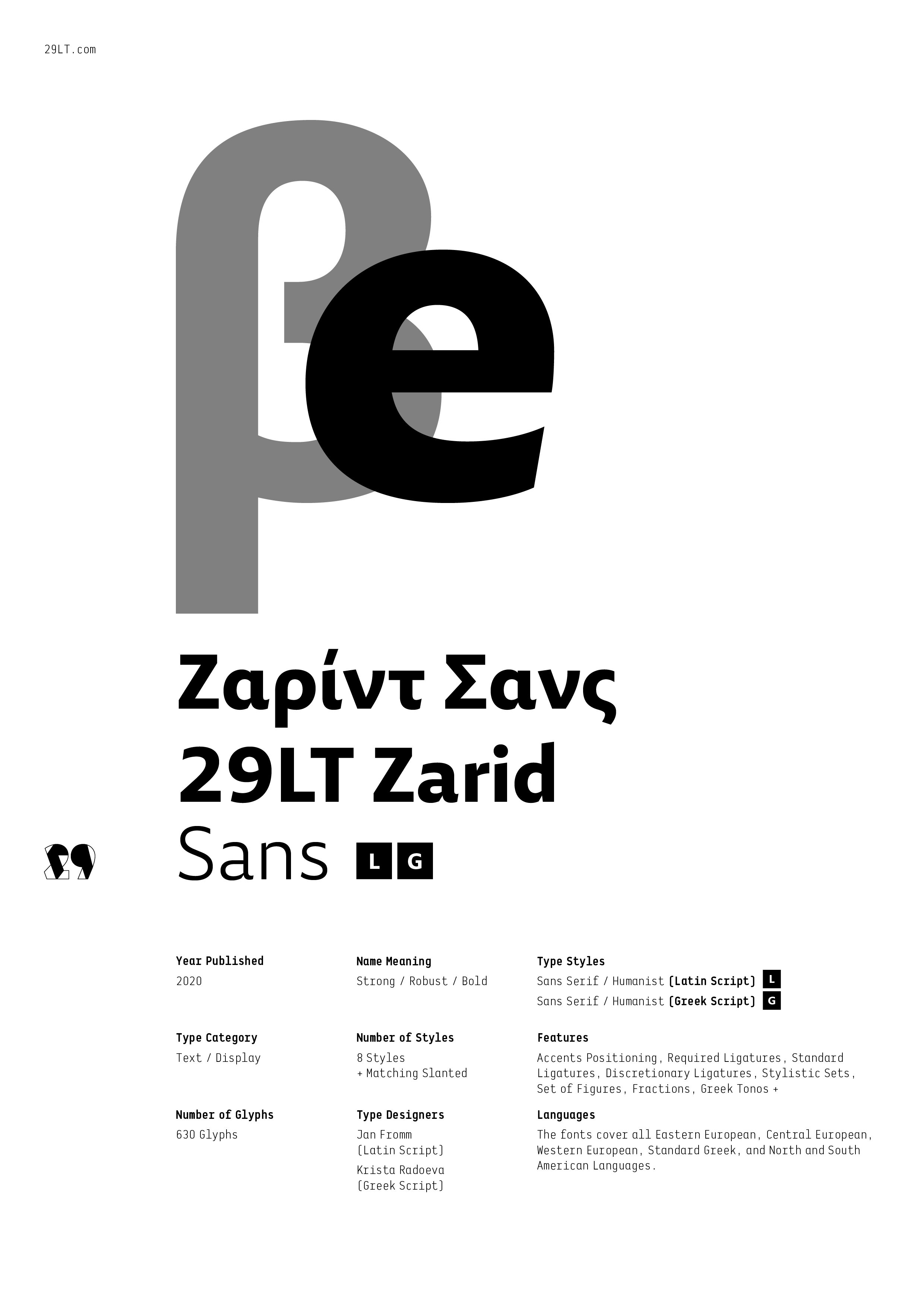
29LT ZARID Sans: A Friendly and Direct Typeface [Latin & Greek]
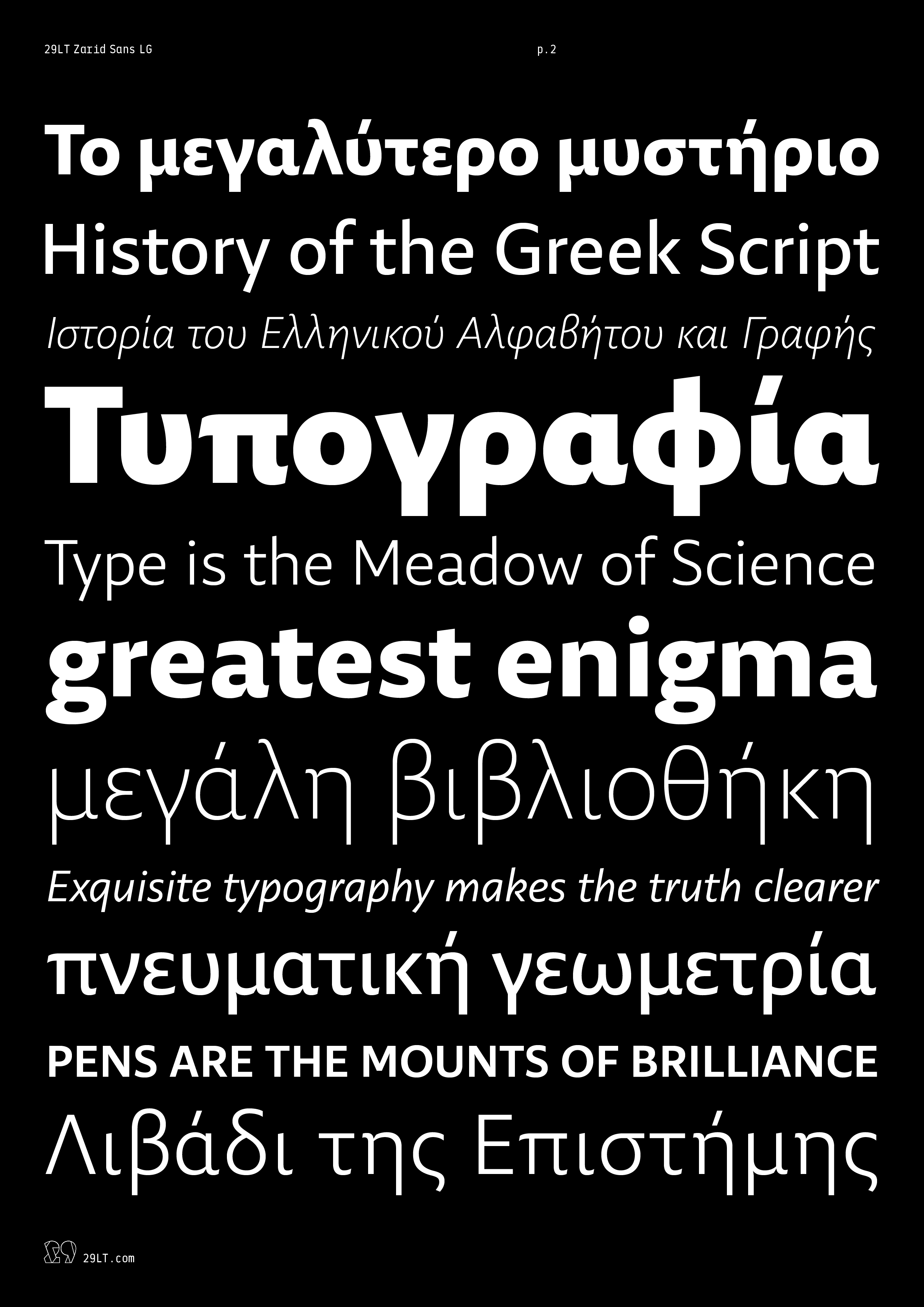
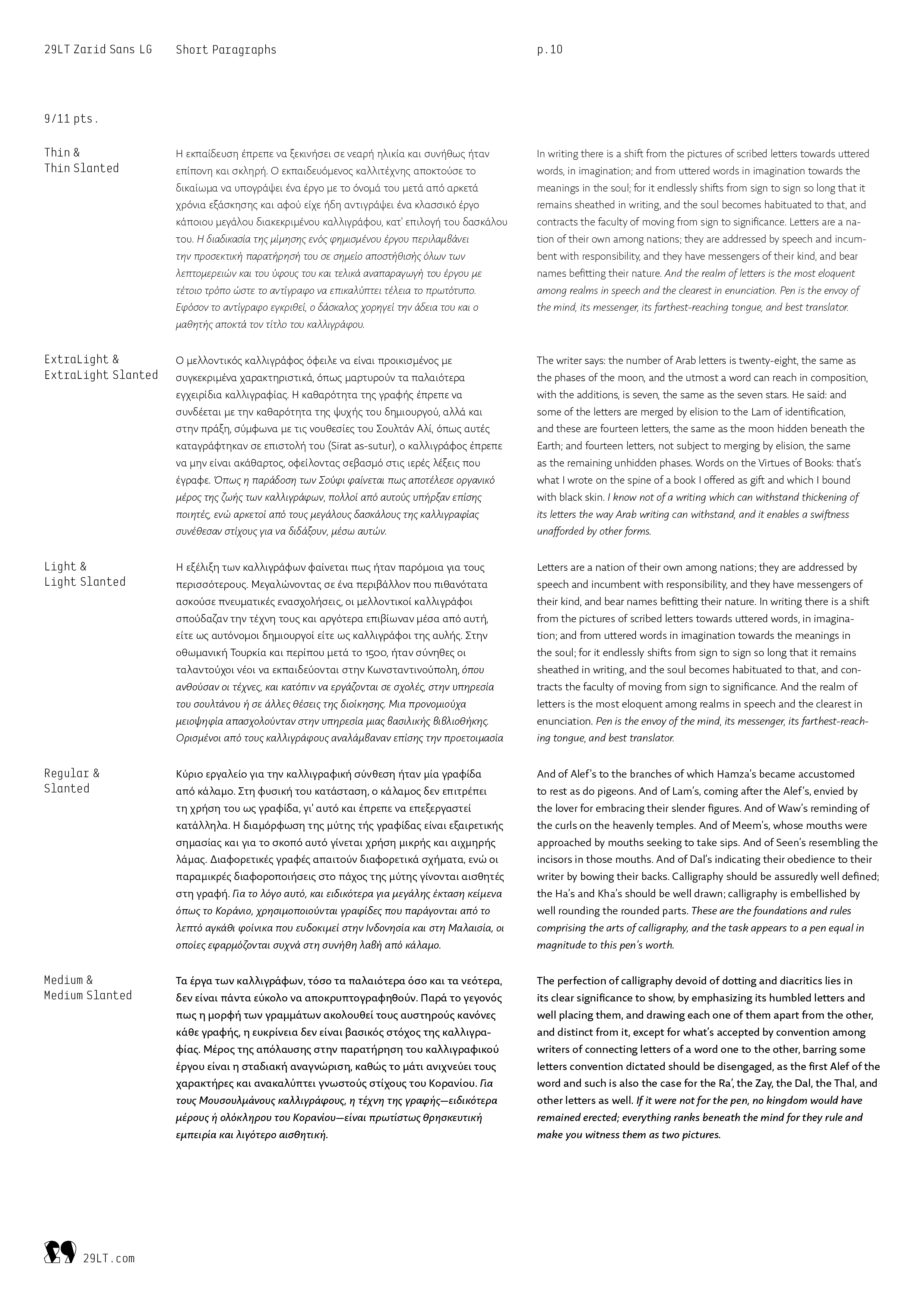
29LT Zarid Sans LG is a sans-serif typeface with roots in calligraphy that are soundly revisited. Clean outlines are balanced out by a humanistic flair, leaving an overall impression of freshness and smoothness. The subtle equilibrium between the main body structure and the letters on one hand, and their corresponding ascenders and descenders, on the other hand, bridges the gap between aesthetics and comfortability and legibility in highly contemporary composition.
The typeface is laced with novel features and graphical qualities, giving it an elegant twist and a modernistic touch. Unlike other geometric and neo-grotesque sans-serif fonts, Zarid Sans LG evokes a feeling of warmth and personality. The Greek set of characters was designed with a neutral approach while preserving some calligraphic aspects in the outlines. Letterforms are built with moderate open x-height and relatively long ascenders and descenders in comparison to other sans-serif fonts.
WHY IT IS A TOP PICK
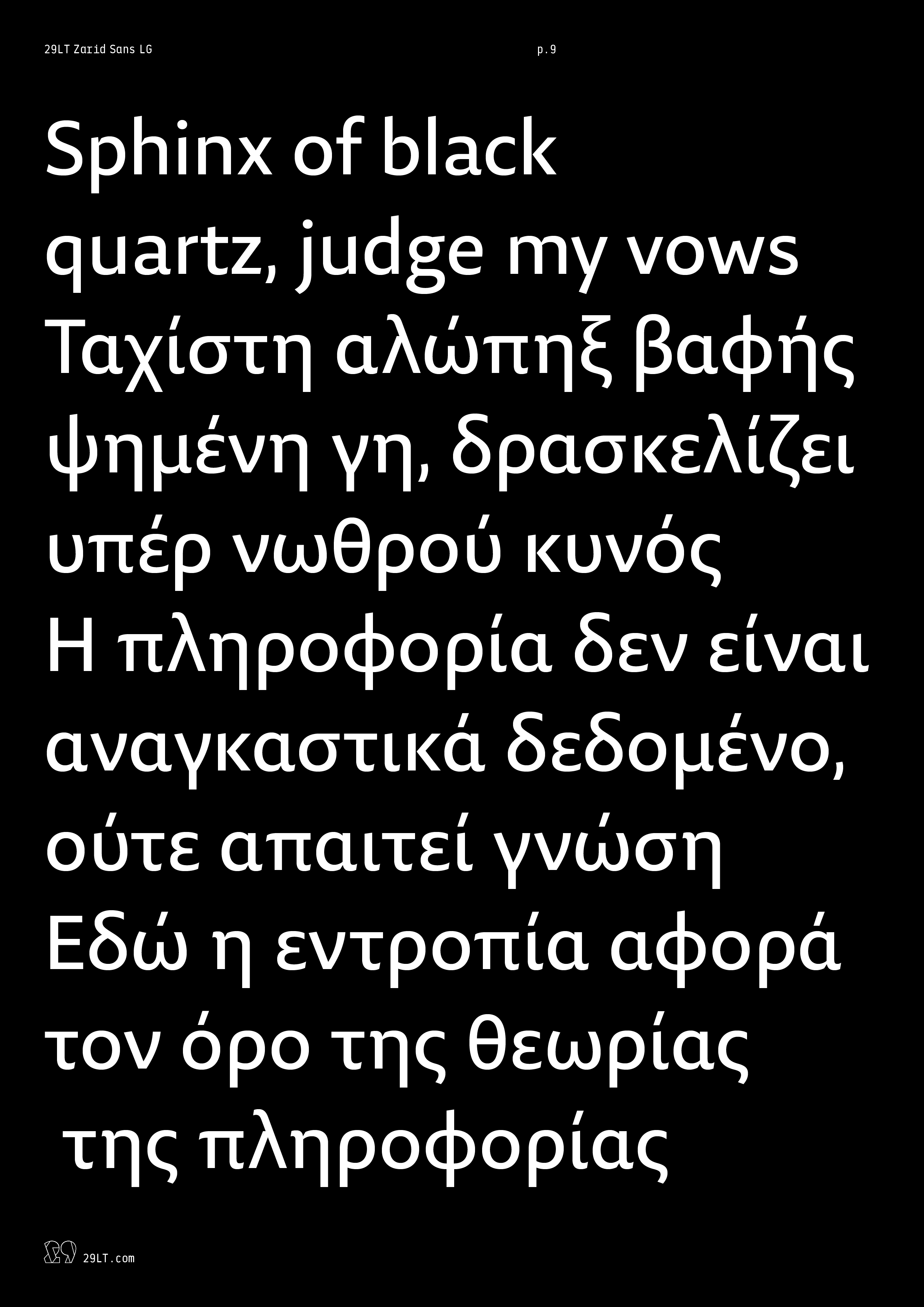
Versatile, elegant, and easy to ready, 29LT Zarid Sans gives diverse typesetting options. It is a clean, crisp, and legible typeface that is proper, though not exclusive, to setting body copy texts both in print and digital mediums. It also works perfectly well when used in large display type.
29LT ZARID Superfamily: Diversity and Cohesiveness
Diverse and well-thought-out, 29LT Zarid Superfamily is a set of typefaces crafted to work together in close harmony and provide visual cohesion. The typefaces share basic characteristics and common designs yet with differing styles and individual variances, each standing on its own as a useful, distinctive type.
29LT Zarid Superfamily retains a balance between calligraphic angular cuts and unadorned construction. The letterforms are inspired by calligraphic makeup but are rather drawn with a contemporary interpretation. The contrast in the letters is coupled with strong cuts and edges lending the font its crowning robust characteristic.
The Greek and Latin scripts are inspired by one another and match each other. Their synergistic design provides even greater cohesiveness to the superfamily.
WHY IT IS A TOP PICK
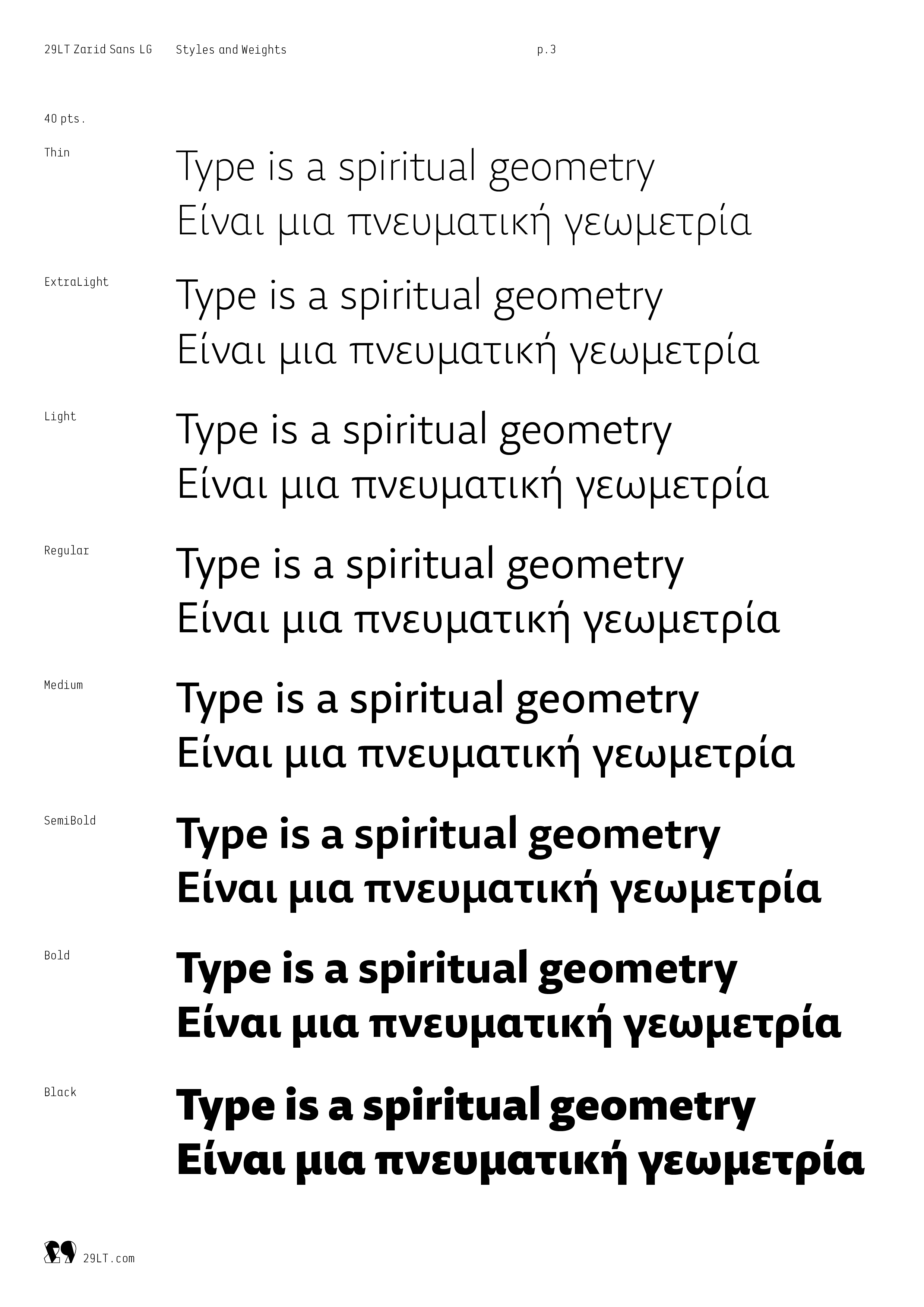
29LT Zarid Superfamily is a design tool for graphic designers to explore endless typographic possibilities and explore different communication complexities in their projects. The typefaces convey freshness, robustness, dynamicity, and modernity. They are designed to be easily readable and cover a range of characters allowing for typographic hierarchies.
Read moreKrista Radoeva (Greek)
Jan Fromm (Latin)
Languages
Standard Greek
Afrikaans, Albanian, Asu, Azerbaijani, Basque, Bemba, Bena, Bosnian, Catalan, Chiga, Colognian, Cornish, Croatian, Czech, Danish, Dutch, Embu, English, Esperanto, Estonian, Faroese, Filipino, Finnish, French, Friulian, Galician, Ganda, German, Greek, Gusii, Hungarian, Icelandic, Inari Sami, Indonesian, Irish, Italian, Jola-Fonyi, Kabuverdianu, Kalaallisut, Kalenjin, Kamba, Kikuyu, Kinyarwanda, Latvian, Lithuanian, Low German, Lower Sorbian, Luo, Luxembourgish, Luyia, Machame, Makhuwa-Meetto, Makonde, Malagasy, Malay, Maltese, Manx, Mazanderani, Meru, Morisyen, North Ndebele, Northern Sami, Norwegian Bokmål, Norwegian Nynorsk, Nyankole, Oromo, Polish, Portuguese, Romanian, Romansh, Rombo, Rundi, Rwa, Samburu, Sango, Sangu, Scottish Gaelic, Sena, Shambala, Shona, Slovak, Slovenian, Soga, Somali, Spanish, Swahili, Swedish, Swiss German, Taita, Teso, Turkish, Turkmen, Upper Sorbian, Vunjo, Walser, Welsh, Western Frisian, Wolof, Zulu.
- Default
- Optional
Check the Bundles tab for discounted deals.
