World Expo
Client: Dubai Government, UAE.
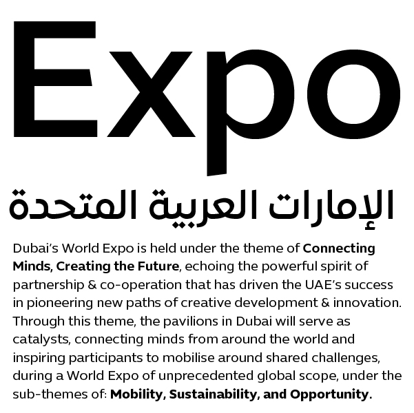
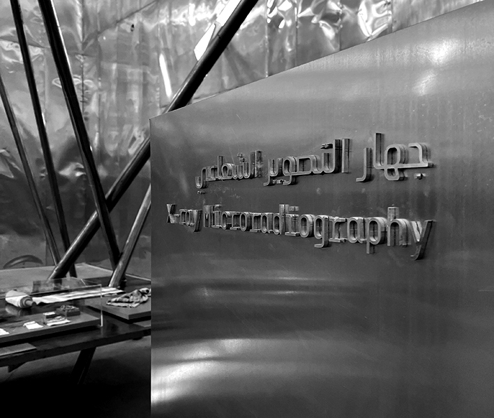
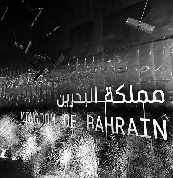
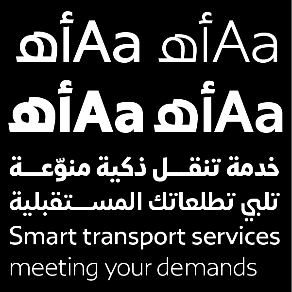
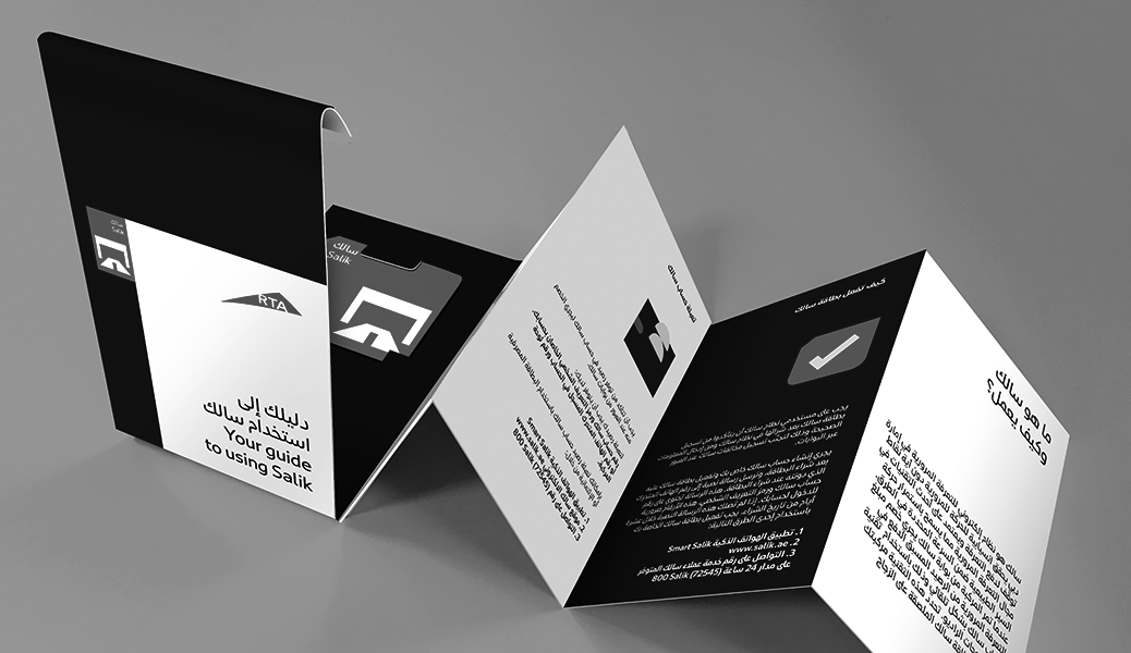
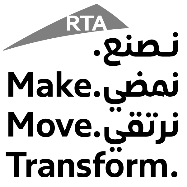
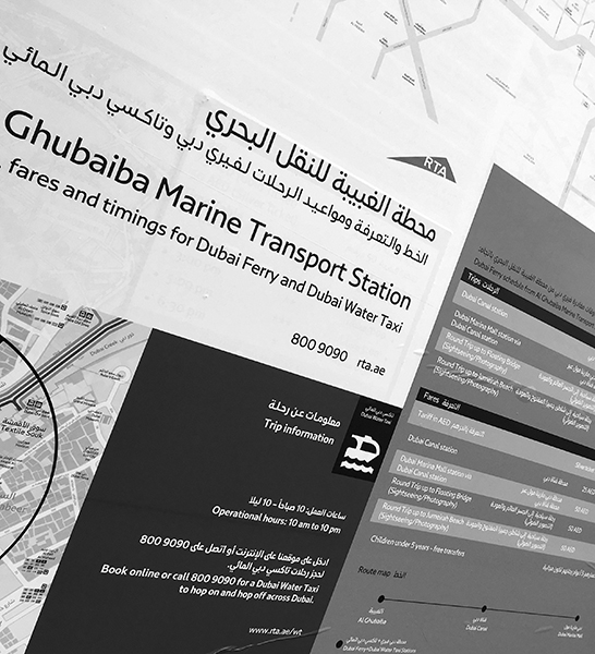
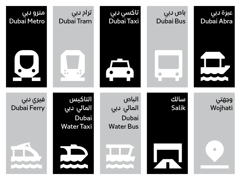
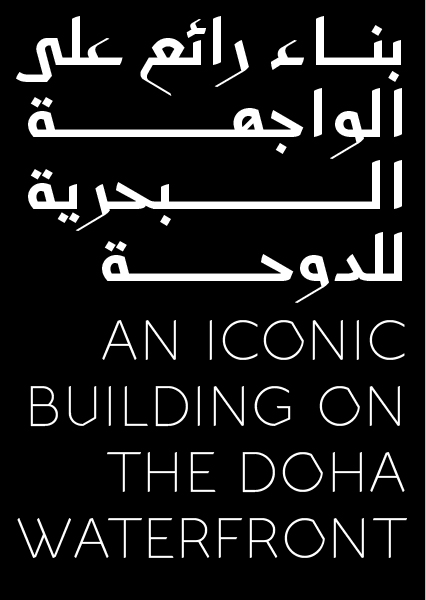
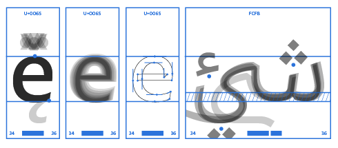
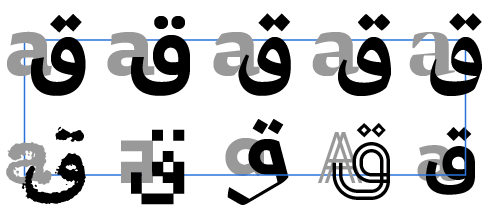
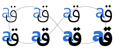
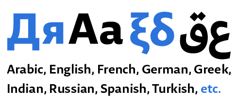
Expo typeface is a bilingual Arabic and English set of fonts born out of a synergistic cooperation between Dino dos Santos from Adotbelow and Pascal Zoghbi. The Latin character set was developed by dos Santos while Zoghbi designed the Arabic. It is a contemporary typeface drawn with extreme refinement in seven weights (Thin, Light, Book, Medium, SemiBold, Bold and Black), capturing the corporate identity of the event. Contemporary sans-serif Latin and simplified Neo-Naskh Arabic sets were drawn to echo the theme of the Expo: “Connecting Minds, Creating the Future”. A clear and open design approach of both scripts lends the fonts a feel of vibrancy and a sense of openness that speaks well to the anticipated 25 million cultural, business, and corporate event visitors, as well as to the hundreds of businesses participating in the Expo.
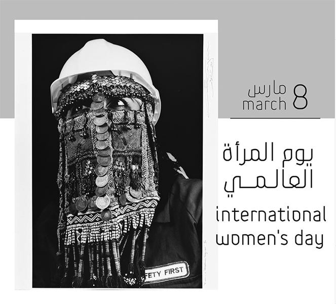
The World Expo in Dubai aims at gathering the global community to forge new partnerships and find solutions that address cultural and business topics, ultimately leaving behind a strong transformative social and economic legacy across the Arab region and the world. The echoing design of Latin and Arabic letterforms was intended to mirror this global partnership.
Expo is a type family created with a maximum legibility focus and an ease of usability mindset. The letterform composition conveys neutrality while retaining its connection to calligraphy. It is a humanistic typeface capturing the essence of Arabic and Latin typographic structures.
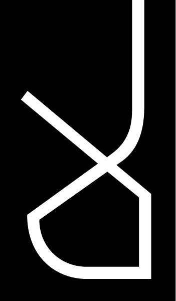
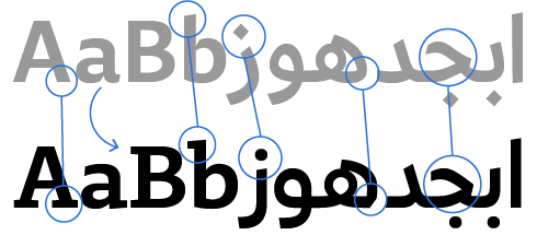
Several elements bring Arabic and Latin scripts together: the design approach, open counters, proportions, terminals and finials, weight, and contrast. Both Arabic and Latin were created simultaneously and influenced each other. Both dos Santos and Zoghbi did not want to sacrifice the value or aesthetics of one script at the expense of the other, hence they approached the same design brief of an adequate typeface in way that preserves the characteristics of each script.

