Museum of Islamic Art
Client: Landor Dubai UAE
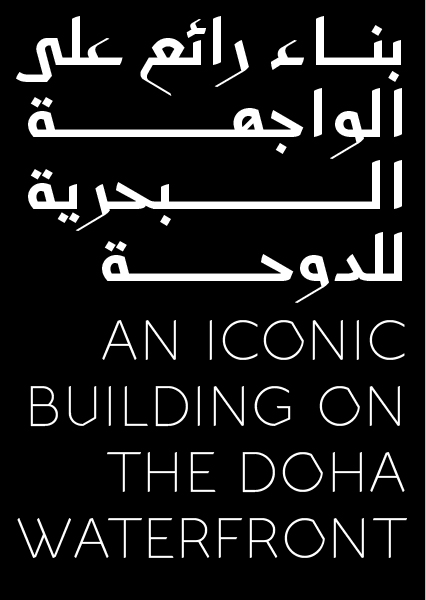
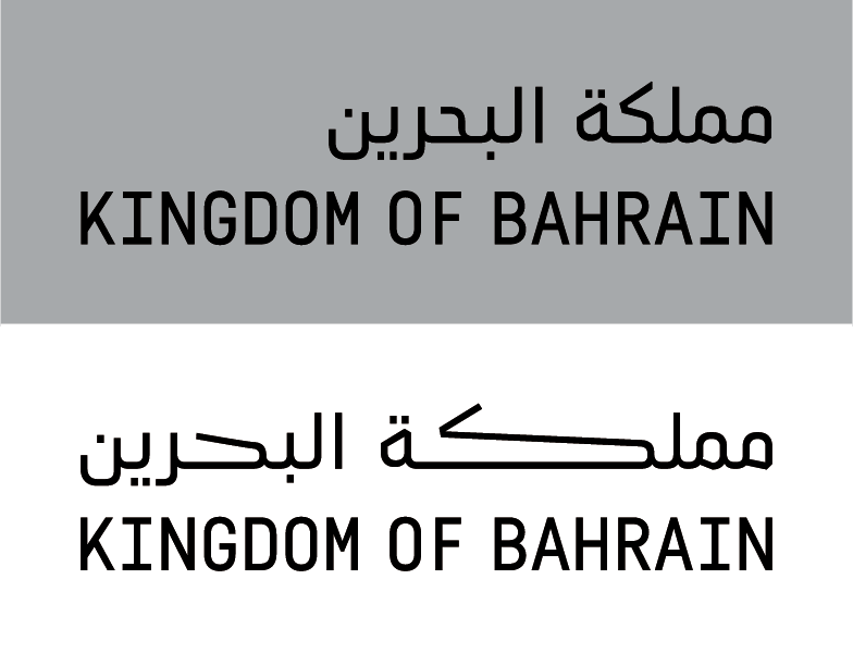
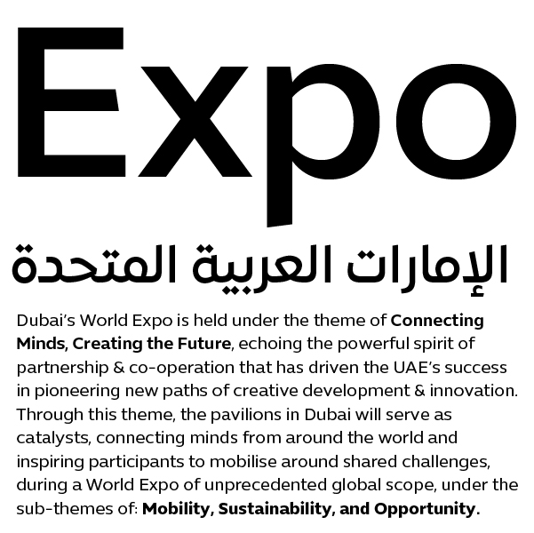
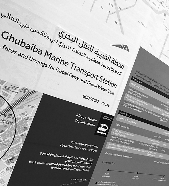
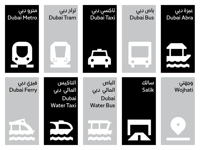
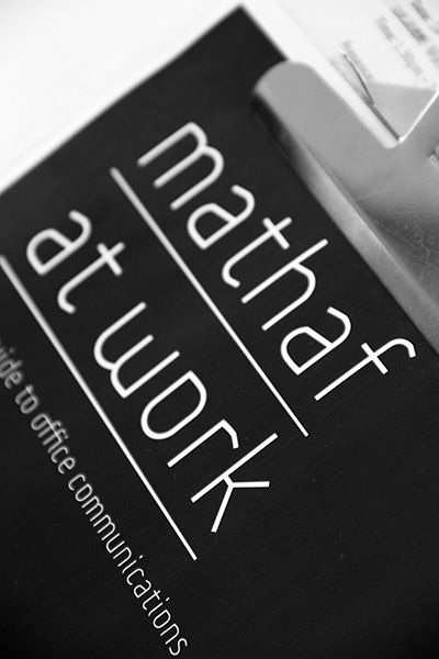
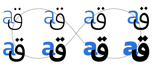
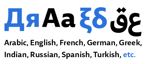
MIA type is a contemporary, bilingual Arabic and Latin type family based on the eastern Kufic calligraphic style. It is drawn in four weights: Light, Regular, Bold, and Black.
The Museum of Islamic Art building is one of the most iconic landmarks in Doha. The renowned architect, I.M Pei, designed the museum with clear inspiration from Islamic architecture. He sought to find the essence of Islamic architecture and to uncover its pure forms. The central courtyard of Ahmad Ibn Tulun mosque in Cairo and Monastir Fort in Tunisia were some of the structures that embodied in his view the purity and spirit of Islamic architecture.
When the time came to work on the corporate type for the museum contracted by the Qatar Museum Authority (QMA), Pascal Zoghbi partnered with Landor Dubai, the company in charge at the time of handling the overall brand redesign. The design brief was based on the idea of “The Cube; The House of Wisdom; The House of Art & Culture”. The cube perspective structure, inspired by the architecture of the building, became the base unit for the creation of a contemporary arabesque grid that, in turn, became the concealed structure for the whole new corporate identity of the museum, including the custom typeface.
Drawing on I.M Pei’s research on the essence of Islamic architecture, Zoghbi took on the challenge of finding the essence of Arabic calligraphy. He undertook extended research on archaic Kufic and eastern Kufic, the Kufic script being the essence of Arabic calligraphy. Arabic calligraphy books focusing on manuscript analysis and studies like “Splendors of the Quran Calligraphy & Illumination” by Martin Ling and “Ink and Gold: Islamic Calligraphy” by Fraser & Kwiatkowski were the starting point of his extensive work in search of the unique Arabic letterforms. Manuscript images compiled from photographs he had taken in museums around the world in the past years, alongside web image databases, became valuable sources for the inspiration and sketching phases.
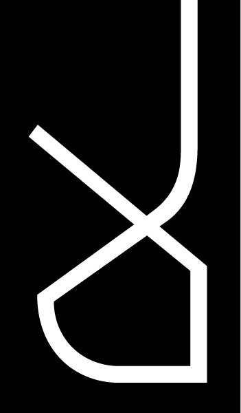
After an analytical study of the manuscripts, Zoghbi produced a matrix documenting the different letter shapes for each of the 28 Arabic letters. He made several drawings for each glyph to find the proper solution to the design problematic. The glyphs had to be developed based on the aforementioned grid, had to have unique postures and remain legible and easily recognizable for fast reading. The contrast between light and shadows in the museum building was reflected in the contrast between the thick and thin pen strokes found in the letters. The heavy letters’ heads, loops, and bowls were contrasted with the type’s ultra-thin finials and terminals.
Since the light and regular weights were going to be set mostly for running text, it was decided to keep them mono-linear in order to preserve legibility. The typeface already has unorthodox letterforms, which are not familiar to the standard reader and adding slight contrast to the light weights would have hindered the reading experience even further.
The bold and black weights on the other hand have extreme contrast between the thin and thick strokes since they are to be used primarily for display settings and in large sizes. The contrast in the heavy weights gives the font an elegant and serious overall feel, bringing it closer to the traditional eastern Kufic style.
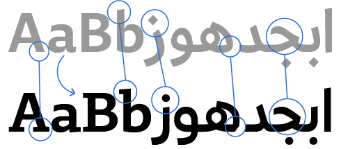
The Arabic and Latin glyphs were drawn simultaneously to ensure the design concept and grid structure work properly in both scripts.
