Bespoke fonts empower your brand.

29Letters Type Foundry S.L. [29LT] is a type and design studio handling multilingual typographic projects while specializing in contemporary bi-script Arabic and Latin typography. Our team consists of independent professional type designers from different countries, who are experts in diverse scripts, such as Arabic, Greek, Cyrillic, and Latin, among many others.

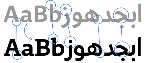
At 29LT, we are adamant on respecting each script's identity and heritage. This allows us to create synergistic multiscript typography that preserves the characteristics and values of each script. Developing scripts alongside one another while maintaining both independency and harmony is at the heart of our work.

We approach bespoke-type projects as part of a whole branding or corporate identity. We partner with our clients, either directly or via branding agencies, to deliver high-end typographic work that best expresses their visual identity. Research leads us in creating unique design solutions, while our collaborative spirit influences our creative process and expands our perspectives. We value team working and we build on it.

We create new typography that is inspired by calligraphy yet drawn in a contemporary manner. Combining the flair of the old with the modern-day touch translates into correct letterform proportions and good legibility outcome.

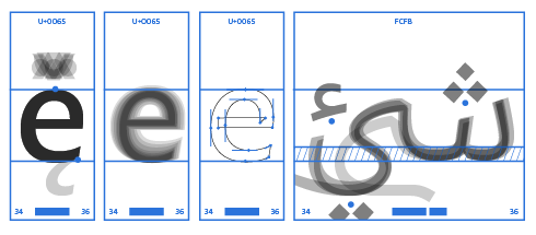
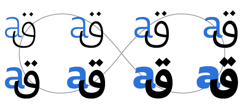
We use the latest type design technology to develop and generate our fonts as well as to create logotypes and letterings. Our typefaces are generated in standard font formats as well as in new variable font formats. Our fonts can be used on cross platforms and mediums, including print, web, and mobile applications.

Contact Us

Noor Bank

Client: Wolff Olins Dubai

Info

Noor Type is a simplified, hybrid Kufi/Naskh type family that comes in three weights: Light, Regular, and Bold. Its contemporary outlines reflect the new branding strategy developed by the brand consultancy in Dubai, Wolff Olins Dubai, for Noor Bank in the United Arab Emirates (UAE).


Noor Bank, formerly known as the Noor Islamic Bank, had a traditional brand identity with an old, serif-style type for Latin characters and a traditional Kufic type for Arabic characters. In order to broaden the appeal of the bank, Wolff Olins worked on giving it a contemporary visual identity. They replaced the old serif-style font with the modern sans-serif “Aktiv Grotesk” type, and solicited Pascal Zoghbi to create the Arabic counterpart.


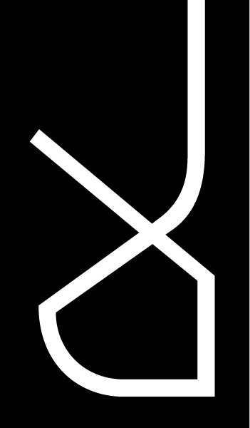
Zoghbi designed the Arabic with large tooth, loop, and eye height to echo the large x-height of the Latin, with short ascenders and cut descenders for the Jeem, Ha’, Kha’, Ain, Ghain, and Meem letters. To allow for such proportions while keeping the Arabic look free from any Latinization, he designed the letters based on a hybrid structure drawing on the Kufic and Naskh scripts rather than adopting just one style of proportions.


Since the wordmark does not have any icon, the typeface is the solitary graphical element to distinguish the bank. Hence, Zoghbi decided to make an edgy cut in the Arabic letters that contain loops and give the font an open and contemporary characteristic. Thus, the font is both edgy and organic, with straight pen stokes that are balanced with curved outlines. The tension between the straight and curved lines gives the font unique properties with a contemporary appearance.


Aside from the logotype, Noor type is used in all of the bank’s branding and advertising. The font can be seen at the Noor Bank Metro Station in Dubai, as well as at all of the bank’s branches in the Arab region.

Read more

Design Space AlUla

Client: Royal Commission For AlUla

Info

Design Space AlUla, located in the AlJadidah Arts District, is a hub for design professionals, students, and enthusiasts, aiming to promote and preserve AlUla’s cultural legacy. The logo, designed by Pascal Zoghbi, incorporates elements from AlUla’s heritage, including ancient inscriptions and modern architectural features.

Besides the symbol, a customized version of 29LT Okaso was created for the wordmark in the logo and the visual identity as a whole.

Read more

Kingdom of Bahrain Pavilion

Client: Bahrain Authority for Culture & Antiquities

Info

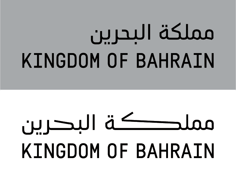
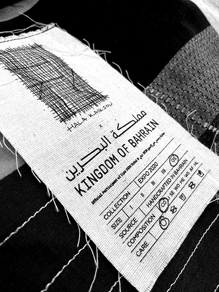
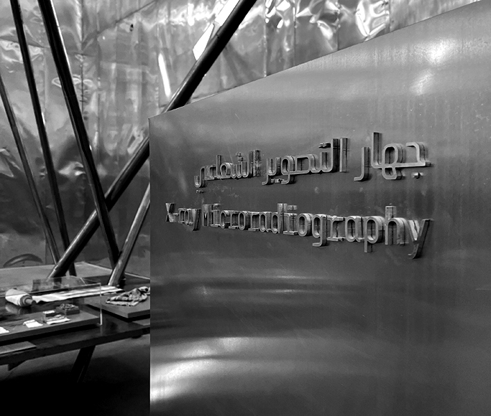
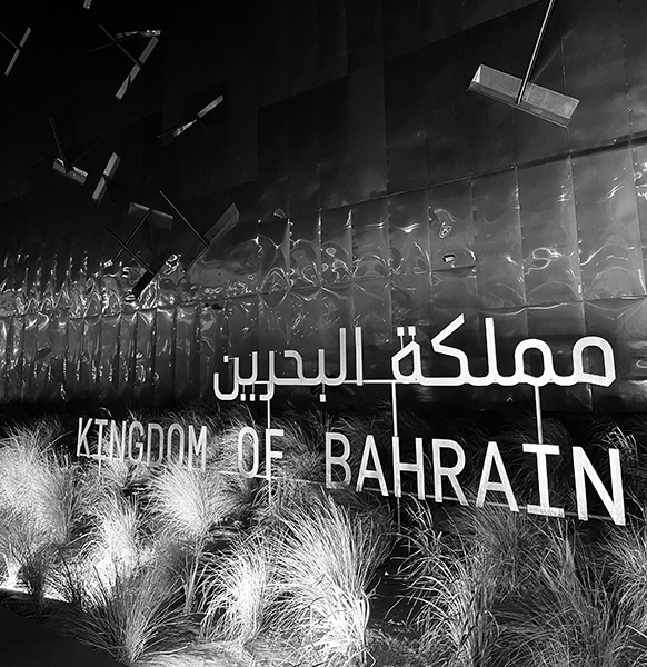
Visual identity for the Kingdom of Bahrain Pavilion at Dubai EXPO 2020.


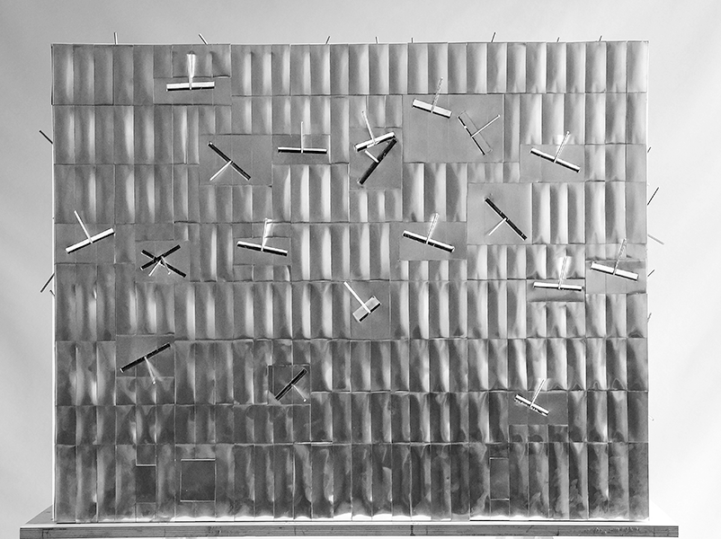
The Kingdom of Bahrain pavilion will focus on the theme of Density as an enabler of opportunities; an intricate exploration of the dense natural and urban compositions of Bahrain.


The design concept responds to the theme and reflects the architectural structure of the pavilion. The elongated letterforms in the typographic design echo the architectural structure of the columns inside the pavilion.


29LT Zawi, a sharp and corporate version of 29LT Baseet, was designed to be primarily used for the typographic visual identity of the pavilion.


The pavilion is conceived as a physical and spatial experience of density and the future possibilities of building in an increasingly dense world. Designed by Christian Kerez architects in collaboration with the UAE architecture firm WANDERS WERNER FALASI Consulting Architects, it is imagined as an open plan space, slightly submerged in the site and reached through a ramp that creates a transition between the outer and inner worlds of the pavilion. The structure of this central space is made of 126 columns of 11cm in diameter and 24m in height that join each other at several points throughout the height of the space.


Visual Identity: Pascal Zoghbi and Clara Sancho
Type Design & Typography: Pascal Zoghbi


Pavilion Website: www.bahrainpavilion2020.bh

Client: Bahrain Authority for Culture and Antiquities

Pavilion Architecture: Christian Kerez GmbH

Read more

World Expo

Client: Dubai Government, UAE.

Info

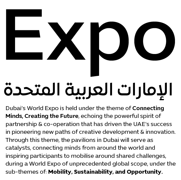
Expo typeface is a bilingual Arabic and English set of fonts born out of a synergistic cooperation between Dino dos Santos from Adotbelow and Pascal Zoghbi. The Latin character set was developed by dos Santos while Zoghbi designed the Arabic. It is a contemporary typeface drawn with extreme refinement in seven weights (Thin, Light, Book, Medium, SemiBold, Bold and Black), capturing the corporate identity of the event. Contemporary sans-serif Latin and simplified Neo-Naskh Arabic sets were drawn to echo the theme of the Expo: “Connecting Minds, Creating the Future”. A clear and open design approach of both scripts lends the fonts a feel of vibrancy and a sense of openness that speaks well to the anticipated 25 million cultural, business, and corporate event visitors, as well as to the hundreds of businesses participating in the Expo.


The World Expo in Dubai aims at gathering the global community to forge new partnerships and find solutions that address cultural and business topics, ultimately leaving behind a strong transformative social and economic legacy across the Arab region and the world. The echoing design of Latin and Arabic letterforms was intended to mirror this global partnership.


Expo is a type family created with a maximum legibility focus and an ease of usability mindset. The letterform composition conveys neutrality while retaining its connection to calligraphy. It is a humanistic typeface capturing the essence of Arabic and Latin typographic structures.


Several elements bring Arabic and Latin scripts together: the design approach, open counters, proportions, terminals and finials, weight, and contrast. Both Arabic and Latin were created simultaneously and influenced each other. Both dos Santos and Zoghbi did not want to sacrifice the value or aesthetics of one script at the expense of the other, hence they approached the same design brief of an adequate typeface in way that preserves the characteristics of each script.

RTA Dubai

Client: Dubai Municipality, UAE.

Info

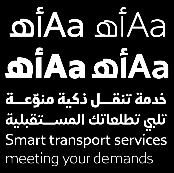
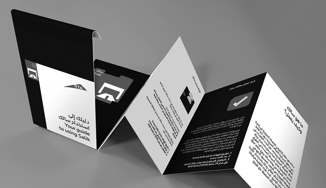
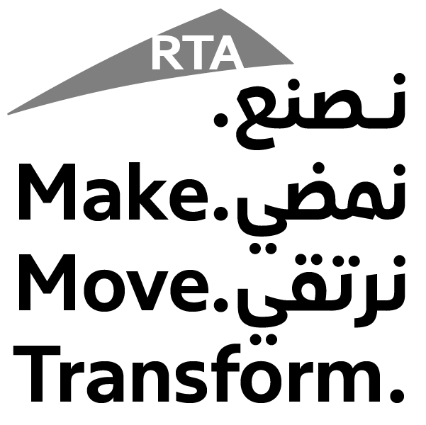
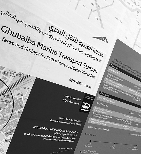
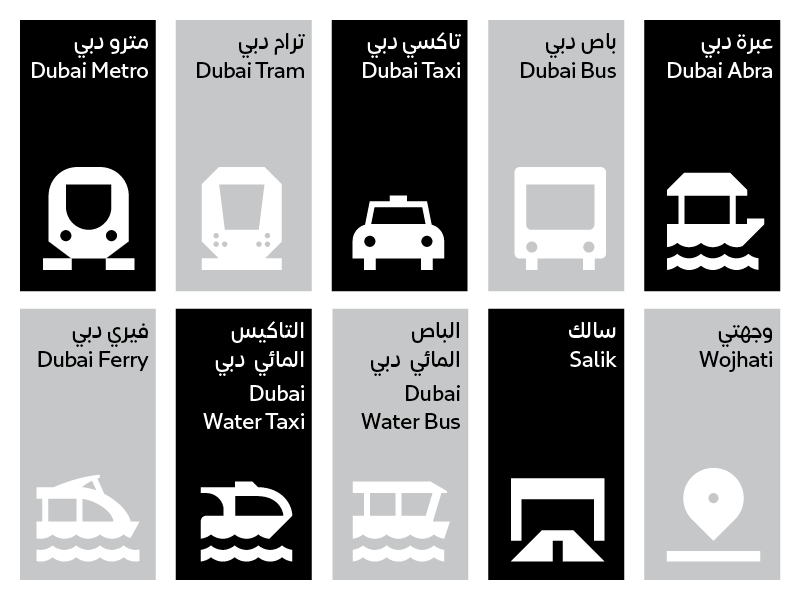
The RTA Dubai bespoke multilingual typeface is composed of a distinct contemporary Arabic Naskh style combined with a humanistic and symmetric Latin sans serif. It is a type family that was created with unique design characteristics while putting legibility first. The typeface was designed to function perfectly in all RTA Dubai transportation systems and communication mediums. With its open spirit and clear outlines, the typeface is easy to spot and read on road signs and all transportation vehicles. It also stands out on RTA website, application and social media platforms.


The typeface seeks to give a modern look and feel to RTA’s signage and visual communication systems. It truthfully reflects the highest tech transportation platforms that are being made available to Dubai commuters nowadays. RTA Dubai covers: Dubai Metro, Dubai Tram, Dubai Bus, Dubai Taxi, Dubai Water Bus, Dubai Car, Dubai Water Taxi, Dubai Ferry, and Dubai Abra.


The type family is composed of 4 weights (Light, Regular, Bold, and Black) covering both Arabic and English languages. It contains an extended set of ligatures to strengthen readability. Pascal Zoghbi, from 29LT, designed the Arabic and Swiss Typefaces crafted the Latin. The project was set in collaboration with the branding agency Wolff Olins Dubai that was behind the creation of the new RTA Dubai brand identity.

Read more

Mathaf Museum

Client: Qatar Foundation

Info

Mathaf, Arab Museum of Modern Art, opened its doors to contemporary Arab art lovers in December 2010 in Doha, Qatar. The museum hosts exhibitions and events that explore and celebrate Arab artists. It is an inspiring space for dialogue and scholarship related to modern and contemporary art in the region and among Arab diaspora.


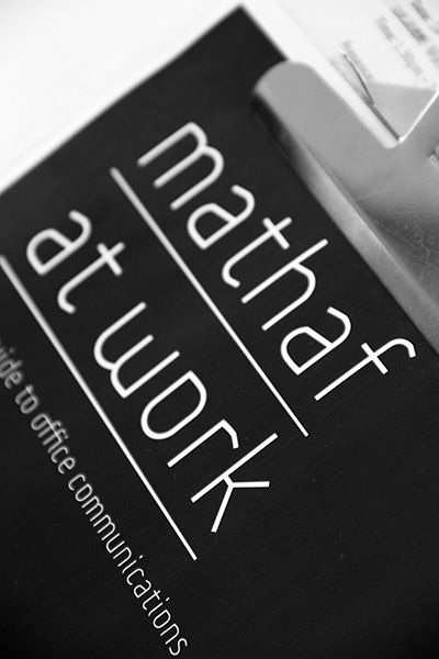
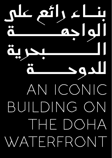
An ultra-thin font lends Mathaf a contemporary image. A strong tension exists when the curvy pen strokes meet with the sharp cuts and corners of the letters. Hybrid modern Kufi Naskh Arabic letterforms complement an edgy lowercase Latin letters to bring out a unique bilingual Arabic–English type.

Wolf Olins New York are behind the comprehensive corporate image of the museum. Pascal Zoghbi was asked to create an Arabic/Latin font to be used for enhancing the museum’s identity, starting with the logotype, signage, publications, advertisings, website, and promotional items.


The Arabic and Latin letters match perfectly together. The font has a unique set of ligatures that cannot be found in standard fonts, thus giving the typeface a unique characteristic.

Read more

Museum of Islamic Art

Client: Landor Dubai UAE

Info

MIA type is a contemporary, bilingual Arabic and Latin type family based on the eastern Kufic calligraphic style. It is drawn in four weights: Light, Regular, Bold, and Black.


The Museum of Islamic Art building is one of the most iconic landmarks in Doha. The renowned architect, I.M Pei, designed the museum with clear inspiration from Islamic architecture. He sought to find the essence of Islamic architecture and to uncover its pure forms. The central courtyard of Ahmad Ibn Tulun mosque in Cairo and Monastir Fort in Tunisia were some of the structures that embodied in his view the purity and spirit of Islamic architecture.


When the time came to work on the corporate type for the museum contracted by the Qatar Museum Authority (QMA), Pascal Zoghbi partnered with Landor Dubai, the company in charge at the time of handling the overall brand redesign. The design brief was based on the idea of “The Cube; The House of Wisdom; The House of Art & Culture”. The cube perspective structure, inspired by the architecture of the building, became the base unit for the creation of a contemporary arabesque grid that, in turn, became the concealed structure for the whole new corporate identity of the museum, including the custom typeface.


Drawing on I.M Pei’s research on the essence of Islamic architecture, Zoghbi took on the challenge of finding the essence of Arabic calligraphy. He undertook extended research on archaic Kufic and eastern Kufic, the Kufic script being the essence of Arabic calligraphy. Arabic calligraphy books focusing on manuscript analysis and studies like “Splendors of the Quran Calligraphy & Illumination” by Martin Ling and “Ink and Gold: Islamic Calligraphy” by Fraser & Kwiatkowski were the starting point of his extensive work in search of the unique Arabic letterforms. Manuscript images compiled from photographs he had taken in museums around the world in the past years, alongside web image databases, became valuable sources for the inspiration and sketching phases.


After an analytical study of the manuscripts, Zoghbi produced a matrix documenting the different letter shapes for each of the 28 Arabic letters. He made several drawings for each glyph to find the proper solution to the design problematic. The glyphs had to be developed based on the aforementioned grid, had to have unique postures and remain legible and easily recognizable for fast reading. The contrast between light and shadows in the museum building  was reflected in the contrast between the thick and thin pen strokes found in the letters. The heavy letters’ heads, loops, and bowls were contrasted with the type’s ultra-thin finials and terminals.


Since the light and regular weights were going to be set mostly for running text, it was decided to keep them mono-linear in order to preserve legibility. The typeface already has unorthodox letterforms, which are not familiar to the standard reader and adding slight contrast to the light weights would have hindered the reading experience even further.


The bold and black weights on the other hand have extreme contrast between the thin and thick strokes since they are to be used primarily for display settings and in large sizes. The contrast in the heavy weights gives the font an elegant and serious overall feel, bringing it closer to the traditional eastern Kufic style.


The Arabic and Latin glyphs were drawn simultaneously to ensure the design concept and grid structure work properly in both scripts.

Read more

Advanced Typography

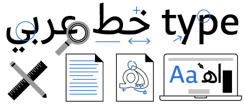
We use the latest type design tools and technology to create contemporary multilingual fonts. Our design experience combined with our technical knowledge ensures up-to-date typographic solutions for original typefaces.

Bespoke Type Design

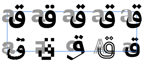
We design bespoke typefaces as part of branding identities for esteemed clients. We create powerful fonts in the appropriate design language and style to capture the nuances of a brand and reinforce a specific visual identity.

Custom Fonts

We can tailor a selected font from our retail 29LT Fonts Catalogue and customize it to fit your specific brand needs.

Type Families

We design type families with an array of weights covering the needs of all your typographic applications in your brand. We can also create dynamic variable fonts with multiple axes to answer your design brief.

Languages Support

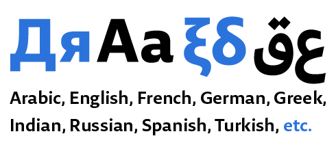
We develop fonts covering the required number of scripts and languages needed for your brand to communicate with all of your target audiences.

Type Design Consultancy

We consult with clients and agencies on Arabic typography. We also provide training and workshops on Arabic typography at corporate conferences, universities, and agencies.

Application Compliance & Cross Platforms

We ensure that our fonts work on different applications and platforms, such as Android, Mac, and Windows. Our fonts can be used on cross platforms and mediums, to include print, web, and mobile applications.

Logotype / Wordmark & Typographic Visual Identity

Besides our type design services, we also create logotypes and wordmarks for brands. A full typographic visual identity can be developed too. We are experts in bilingual Arabic and Latin typographic design.

Cookie Policy: This site uses cookies. By continuing to browse the site, you are agreeing to our use of cookies. Find out more. I agree